Easter Design & Print
Direction.
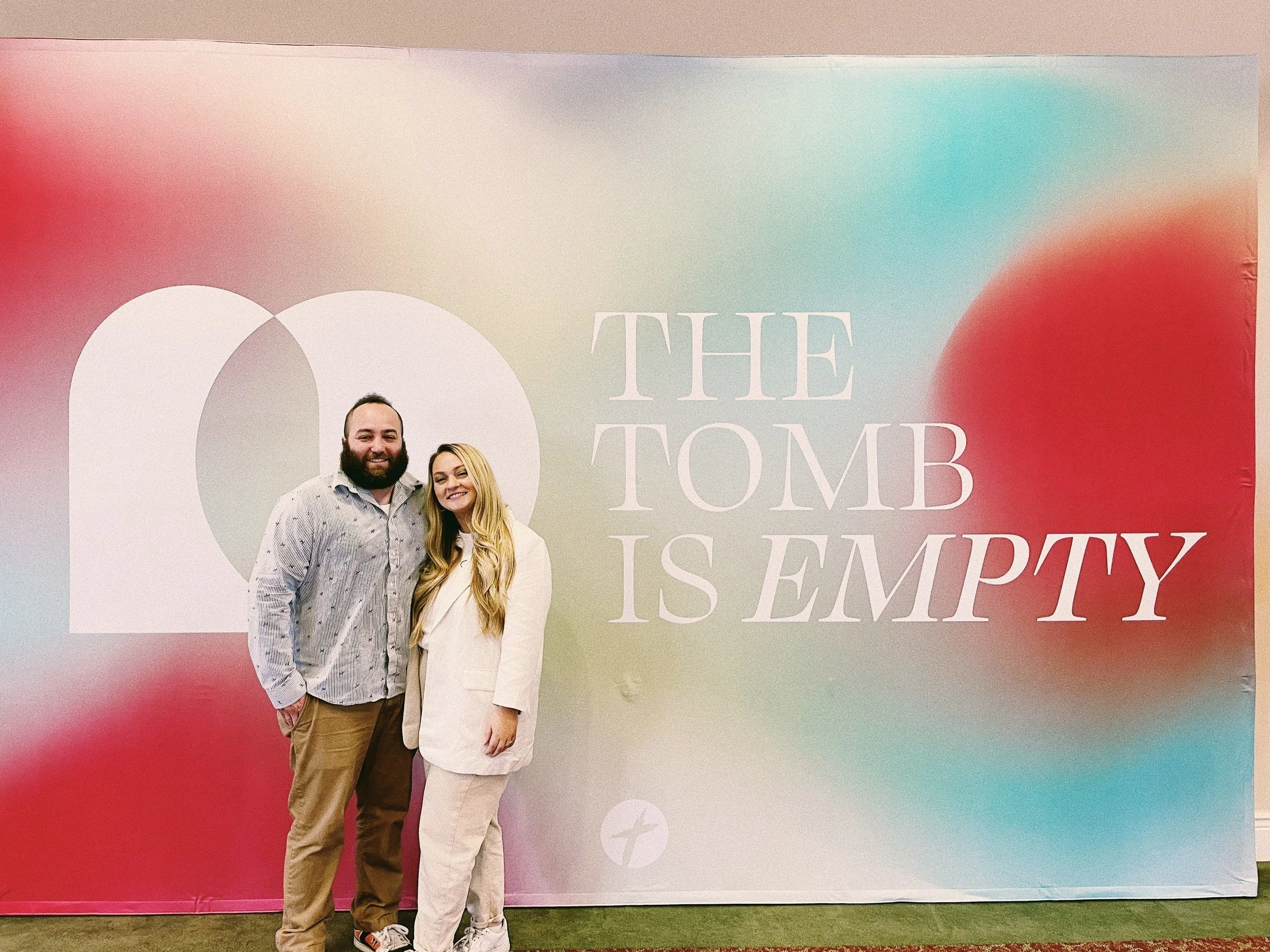
This Easter Sunday had a focus on the “old self vs new self” concept. This would lead well into the following sermon series “The Struggle Is Real” as we discuss the struggles we experience in our daily lives.
The main inspiration for the Easter branding this year was RGB light refraction. When standing in front of an RGB light, a single silhouette becomes three. This art style emphasizes a theme of dissonance - relevant to the project’s direction.
The main Easter logo includes an RGB-styled crown of thorns and palm leaf. The classic tomb and stone was reimagined by subtracting the inside shape representing an “empty grave”.
Marketing & print.
T-shirt design
Designed with the intent of being a “walking billboard”. This band-style tee was sure to strike up a conversation - with one turn you have the times, date, and website on the back.
“Mailer”
Looking to be more creative with our Easter outreach, I proposed the idea of “Easter Basket ‘Mailers’”. Inside was an invite card designed to look like an Instagram post, effortlessly including every single Easter Sunday detail. Our congregants were encouraged to take a basket, fill it up, and invite a friend.
Invites cont.
Visuals can be both digital + physical. Physical visuals often excite our congregation. This design was created to have a Peep attached to the top right. A fun, and delicious, way to challenge our church.
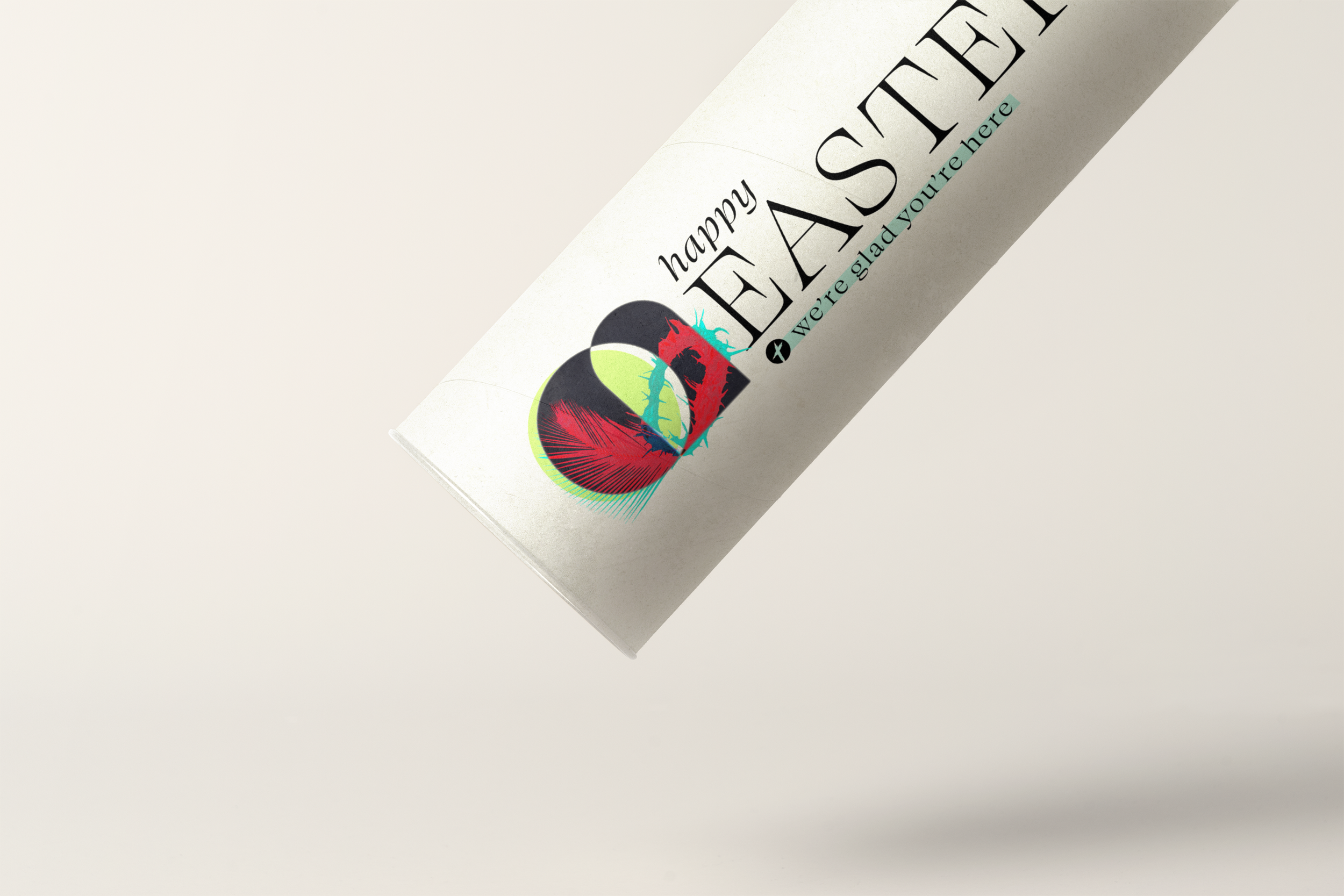
Welcome Tubes
First Time Guests always receive a “Welcome Tube” when they visit. This tube cover design remained consistent in branding and inviting in nature. The cover is printed on a vinyl sticker. The tube is then wrapped and filled with other merch items.


